...

EdTech Mobile App

Project Type
Mobile App
Duration
2 Months
Tools
Figma
Adobe Photoshop
Flutter
Case study for Edtech mobile application

Gone are the days when education was confined to classrooms, and the digital world is reformulating the education system and offering a better learning experience for the students.
The edtech mobile application has maintained consistency in the design system, especially across layout, typography, assets, icons, and colors for enhanced user experience. Therefore the design system enhances the comfort of using the application. The learning app is filled with high-Quality video content for the enhanced learning experience and a better understanding of the subjects. The contents are also categorized and well-managed to pick it up easily by the student.

Objective

To design an app based platform that lets user join and participate in educational courses with hundreds of video content

Process

Developed our product through the following five phases: Research, Synthesize, Ideate, UI Design & Test.

Research

Competitor Analyses
User goals
User pain points

Synthesize

High level design goals
Key features & motivations

Ideate

Card sorting
Site map
Task flow

Ui Design

Logo design
Low-fi sketches
Style

Test

Usability testing
Iteration & implementation
Hi-fi prototypes
Final screens

Profile page

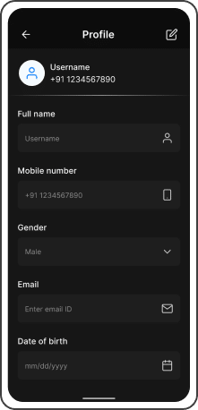
The application enables the user to enter and save personal details such as name, mobile number, email Id, date of birth, and other personal information to personalize the application. The information can be edited anytime with the help of the “edit icon” given at the top right corner of the page.
This appealing feature encourages the student to share their profile with a large community.

Home screen

The application provides over a hundred courses in video formatTo start the progress without much distraction, the application has been designed to line up the courses preferred by the students on the first page. The courses are aligned in the form of large icons on the first page with their names on it. This enables the student to choose across the courses easily.
The progressing courses are also aligned on the home screen, therefore to distinguish them from the completed course.
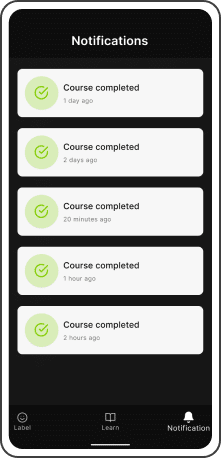
The important updates related to the user’s interest or any updates related to the courses can be viewed under the “notification section”.

Categories

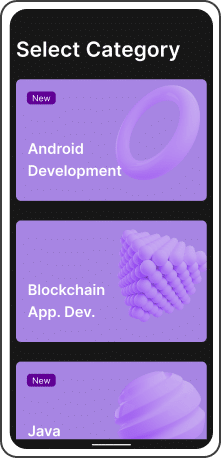
The category section shows a list of various subjects to choose from, and the subjects will be labeled new if they are new to the application

The app bifurcates the courses into two categories, which are lessons of the course that are in progress and the ones that are not yet started. After selecting a particular course, the user will be able to view the number of lessons in a course with time duration and a brief introduction written about the course at the beginning of the course

After selecting the course

After the user had selected the course, the application takes the user to the payment page with course duration mentioned. At this stage, If the user likes to share the course with his friends, and the share button on the page helps in doing that.The user will be taken into the course after he/she presses a bold “start button” popping at the center of the page.
At the bottom of this page, the user will be given the details about the course and the experts involved in the curation of the course.
After the selection of the course, the user will be able to view the lessons that are named and listed in the introduction.

Achievements

The application helps the user to acquire his/her course completion certificate after completing the course. This certificate can be downloaded and can be saved on the user’s device for future purposes.
The date of completion is also mentioned, which helps the user to enhance productivity or to plan for other courses.
Work Showcase

Take a look at our other projects

We have worked on some amazing projects for some great clients. Check them out

Start a Project with Tandemloop

Take a moment & tell us about your project needs