The Myth of Seamless Figma-to-Production Workflows
2025
Tandemloop

Why Figma MCP Isn’t Enough
Why Figma MCP Alone Can’t Guarantee Production-Ready UI — and What Product Teams Must Do Instead
Extraordinary results require an extraordinary team.
I’m surrounded by people who treat design and development like a mission. They are warriors in the tech trenches, and this win belongs to them.
No fluff. No filler.
Just the facts on how we shattered our velocity records without sacrificing production accuracy.
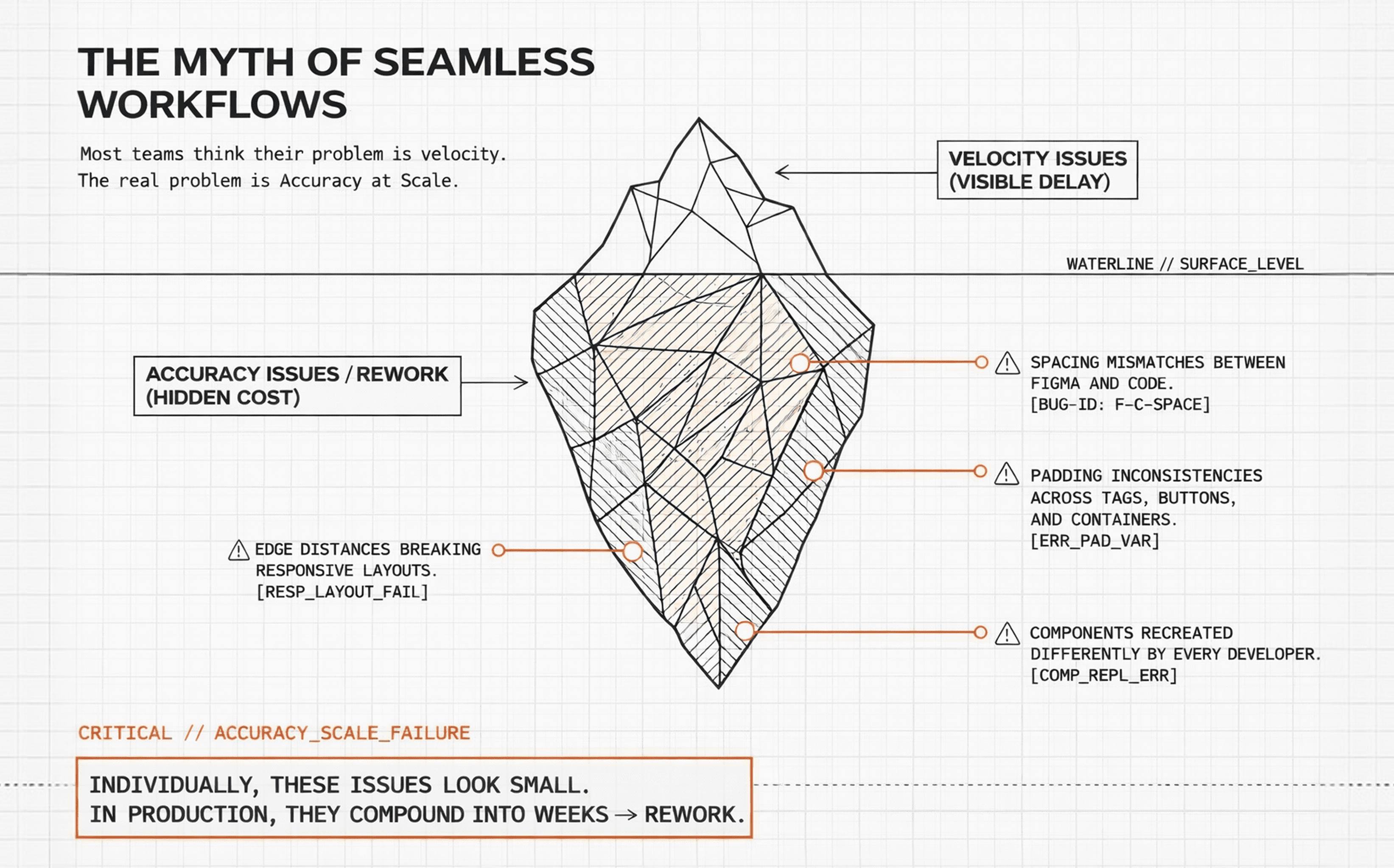
1. From Minor Mismatches to Major Rework
Most teams believe their biggest UI problem is velocity. (how quickly they can build interfaces)
In reality, the bigger problem is accuracy at scale.
Even after strong designs, we repeatedly ran into issues like:
Spacing between elements not matching Figma
Padding inconsistencies between tags, buttons, and containers
Edge distances breaking responsive layouts
Components recreated differently by each developer
Minor pixel mismatches causing repeated QA cycles
Individually, these issues look small.
In production, they compound into weeks of rework.
2. Why Traditional Figma → Dev Handoffs Fail
The problem was never Figma.
It wasn’t the developers.
And it definitely wasn’t effort or intent.
The real failure was an assumption:
“Designs are visual. Developers will interpret them.”
That assumption holds at small scale — and collapses at real ones.
It breaks when:
Components look the same but behave differently
Spacing is suggested, not specified
Design and code speak different naming languages
Changes land in design but never ripple through the system
The outcome is predictable:
Design becomes static.
Development becomes interpretive.
And interpretation is what breaks at scale — because every developer interprets differently.
Our brief, beautiful tragedy
I remember this one project where we had a bunch of devs working at once, and we all treated Figma like it was the holy grail.
At first? Smooth sailing. The screens looked clean, tickets were moving, and the vibes were good. But then the small changes started creeping in, and things got messy fast.
A tweak that took a designer thirty seconds to drag-and-drop turned into three separate meetings for us. One screen would be perfect, but the next one—supposedly using the same component—would be totally off. It was exhausting. The designers felt like they were repeating themselves, and as developers, we felt like we were stuck in a loop, fixing the same bugs over and over.
The deadlines weren’t tight because the code was hard; they were tight because we were burning time trying to guess the intent of the design rather than just building it. That’s when it hit me: the problem wasn't our effort. It was that the design wasn't actually speaking the same language to all of us.
You can explore the links below for a clearer view of the project details and UI screens referenced above.
UI Screens: CMS Dashboard page, CMS Station configuration page
Project link - EV Charging Management - Admin and CMS
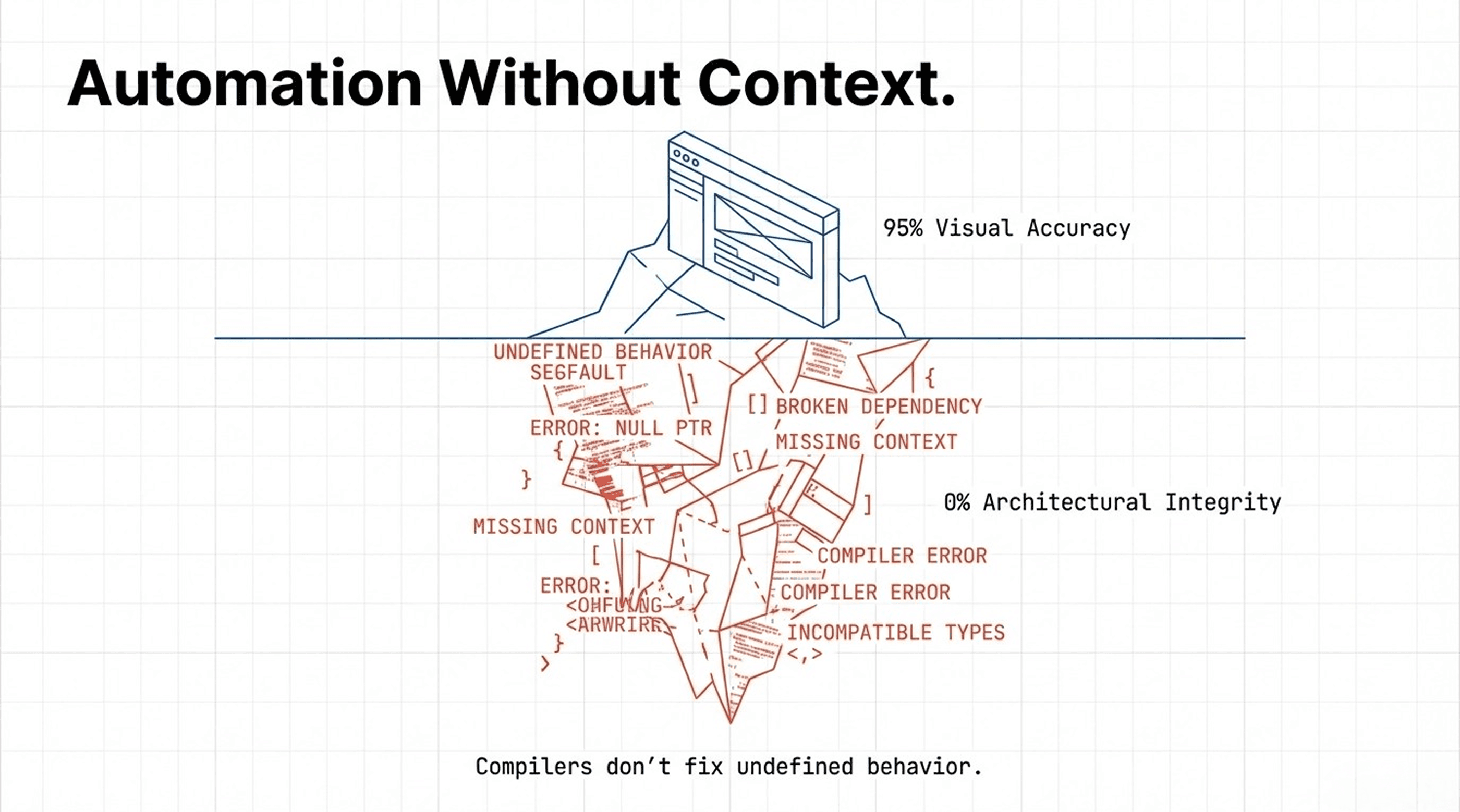
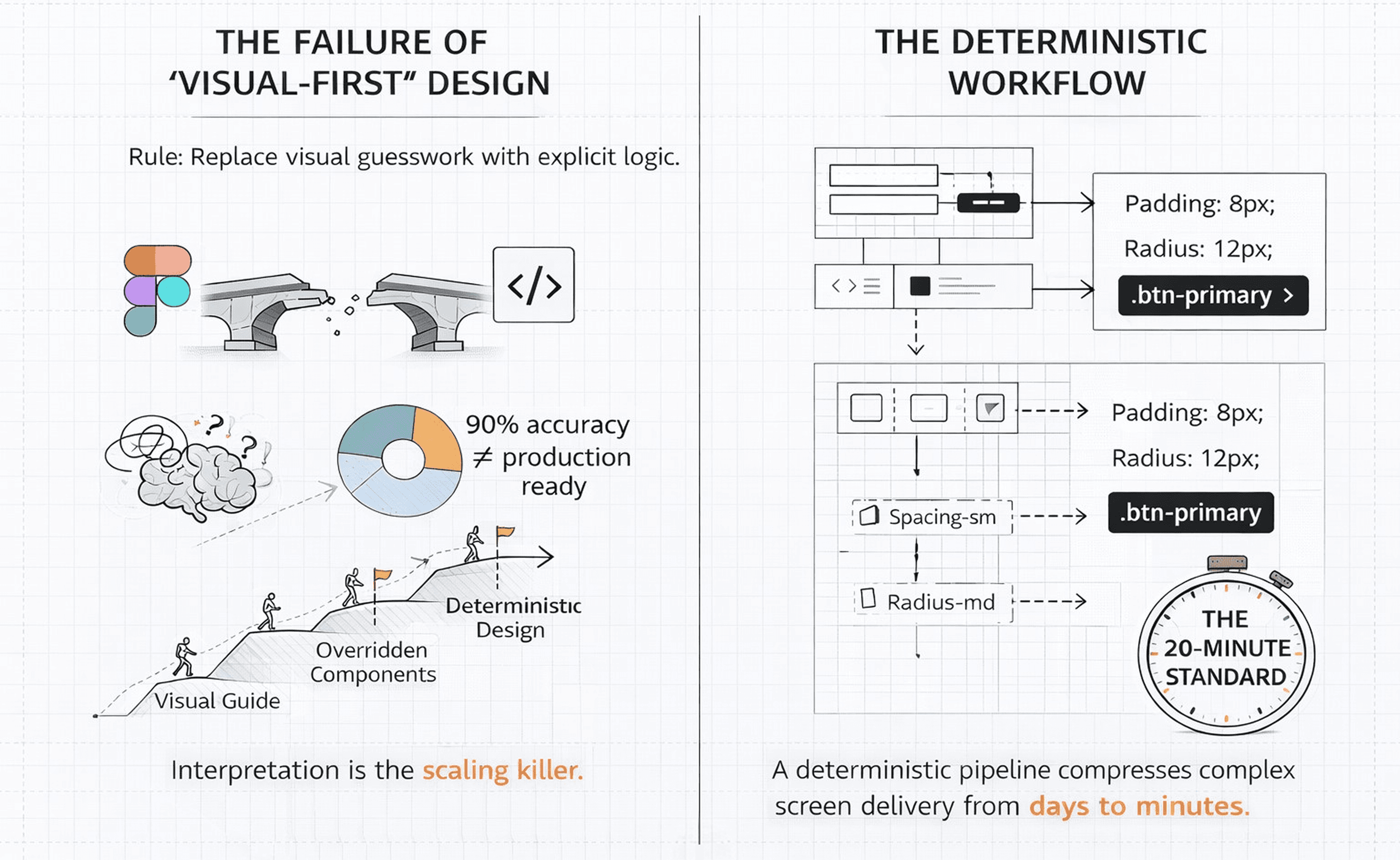
3. Looks Right ≠ Production Ready
We explored multiple tools to automate Figma → code translation.
When we started using Figma MCP, the initial results looked promising:
~80–95% visual accuracy in a single pass
Faster initial scaffolding
Minimal manual setup
But once we tested it in real production projects, the cracks appeared:
Components were generated from scratch
CSS was defined at page or section level
Design systems weren’t consistently followed
Existing components weren’t reused
Output didn’t align with our internal architecture
The UI looked correct.
The output was not production-ready.
MCP is not a design system. It’s a compiler.
And compilers don’t fix undefined behavior.
Automation without context still fails.
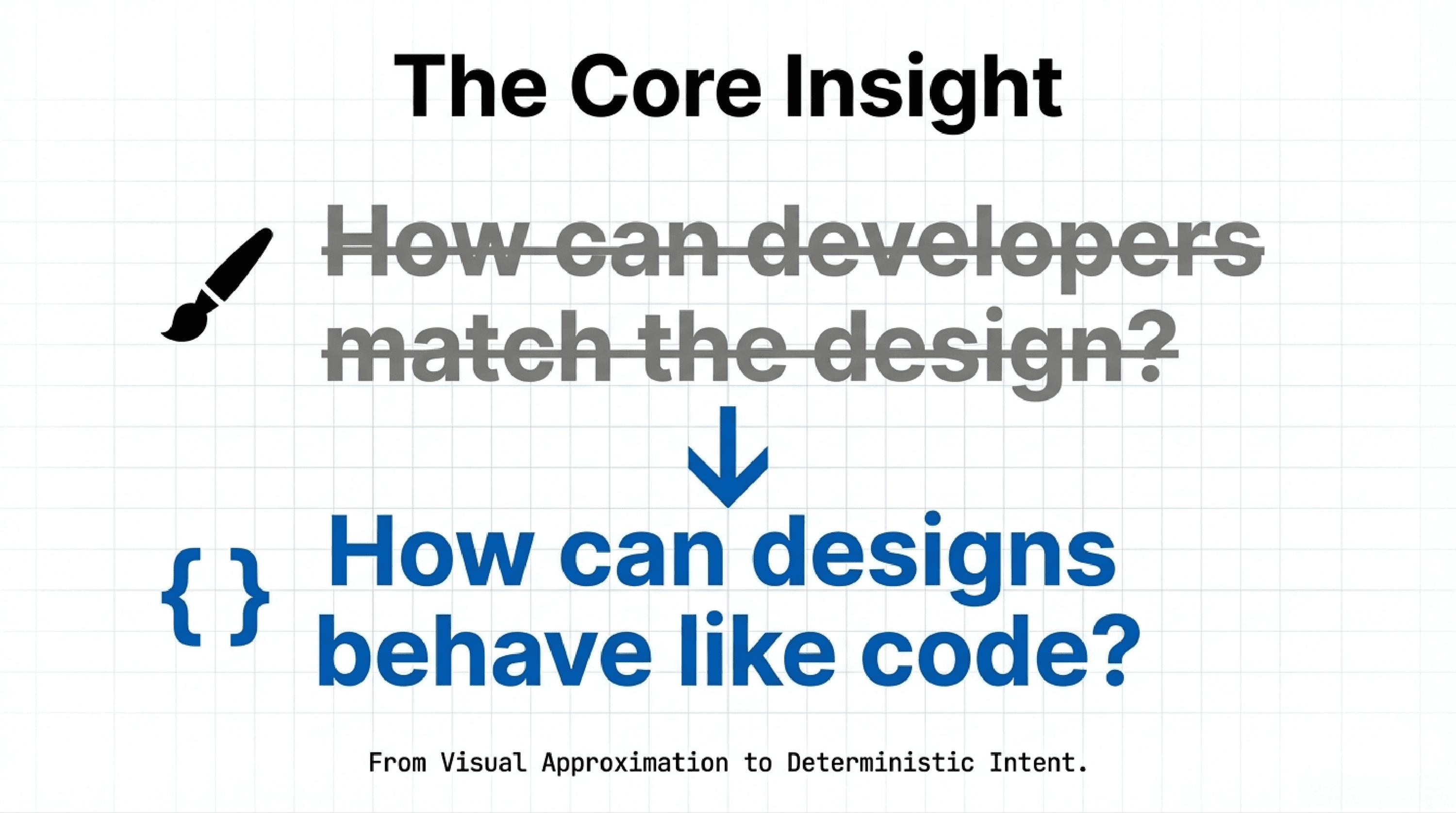
4. The Core Insight: Why Design Must Follow Engineering Rules
The breakthrough came when we flipped the question.
Instead of asking:
“How can developers match the design?”
We asked:
“How can designs behave like code?”
That single shift changed everything.
Our new operating laws
Figma is a source of truth, not a visual reference
Every design decision must be deterministic, not interpretive
Design output must be reproducible, just like code
Anything that cannot be expressed as a component or parameter is a design defect
No visual-only exceptions — everything must map to a real implementation
Designs must fail loudly, not silently
This isn’t idealism.
It’s how scalable systems survive.
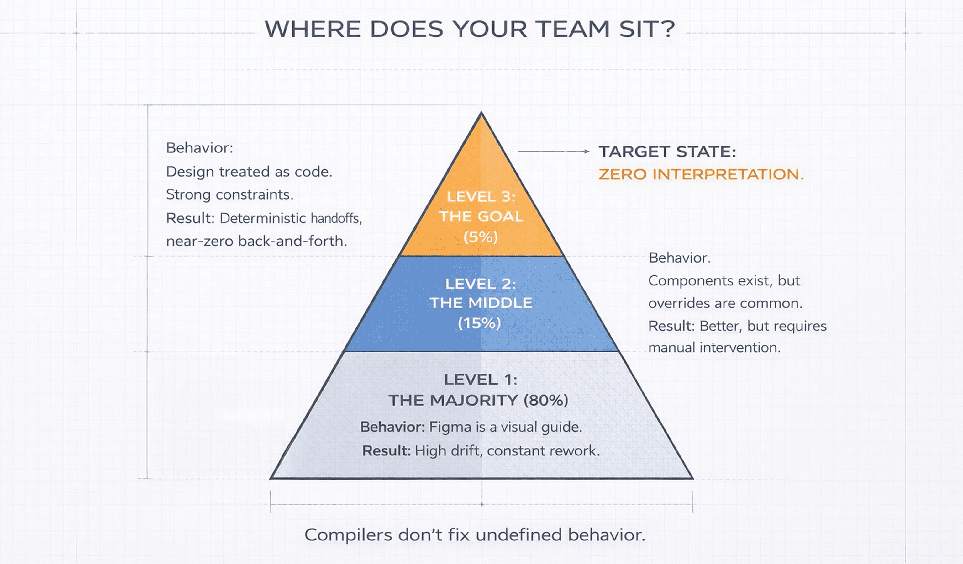
A hard industry truth
In practice:
70–80% of teams treat Figma as a visual guide
Developers are expected to “figure it out.”15–20% of teams sit in the middle
They have components and tokens, but overrides and “just this once” tweaks still happen.5–10% of teams treat design like code
Strong constraints. No visual-only exceptions. Clean 1:1 mapping.
For that small group:
fewer handoffs
fewer bugs
dramatically less back-and-forth
Once teams reach this level, they almost never go back.
5. Turning Figma into a Deterministic System
We stopped treating Figma like a mockup tool and started treating it like production code.
1. Enforced Component Hierarchy
Foundation: buttons, text, icons
Building blocks: cards, forms, nav items
Structures: layouts, sections, pages
Each layer is:
reusable
composable
constrained by the layer below
No skipping levels.
No ad-hoc assemblies.
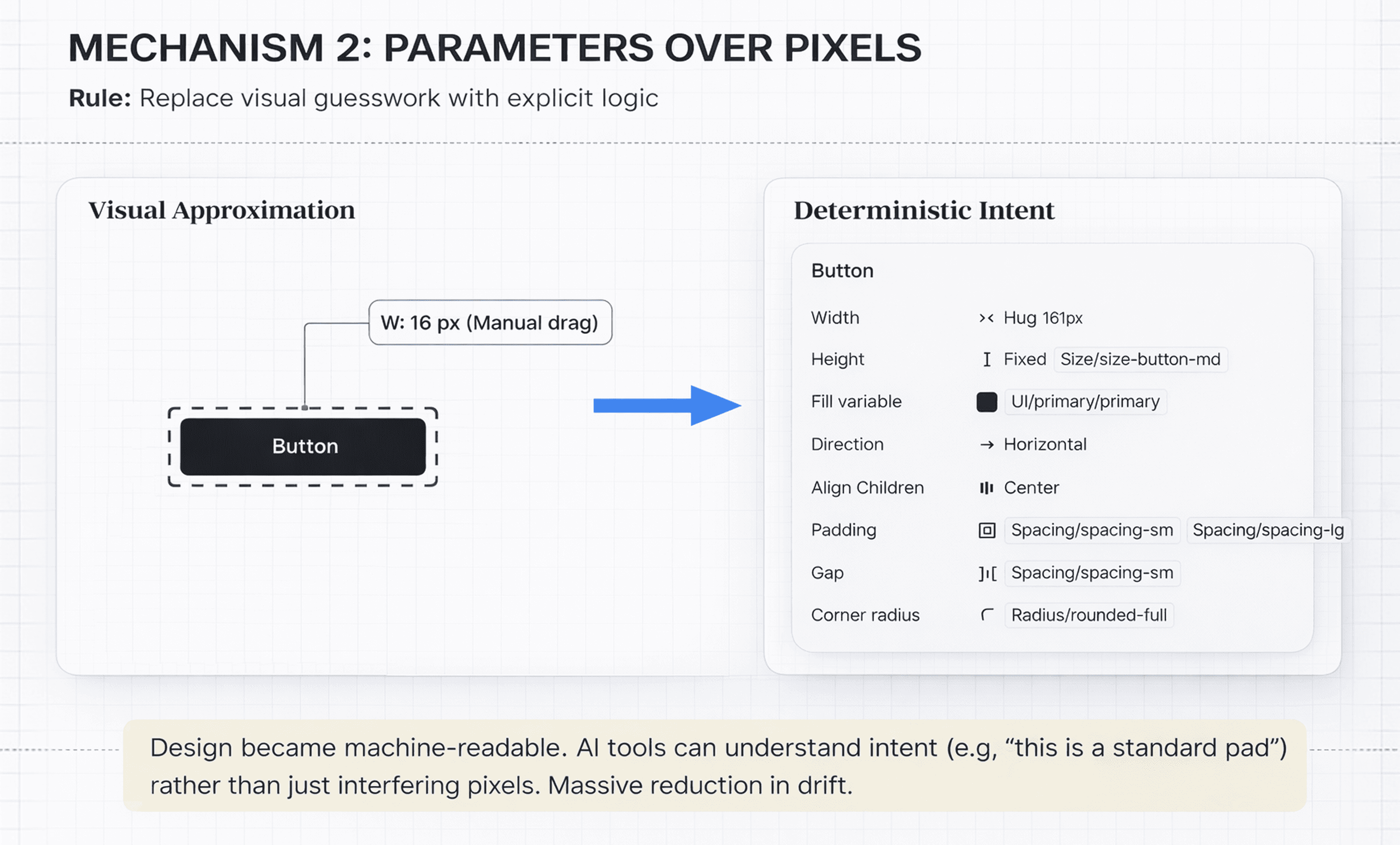
2. Parameters Over Pixels
We replaced visual guesswork with explicit rules:
Spacing comes from tokens
Padding is a parameter
Border radius is a variable
Typography is system-defined
Designs became machine-readable, not just human-readable.
As a result, AI tools (including MCP) can:
understand intent instead of inferring it
reuse existing components
generate output that holds up at scale
Small shift.
Massive reduction in drift.
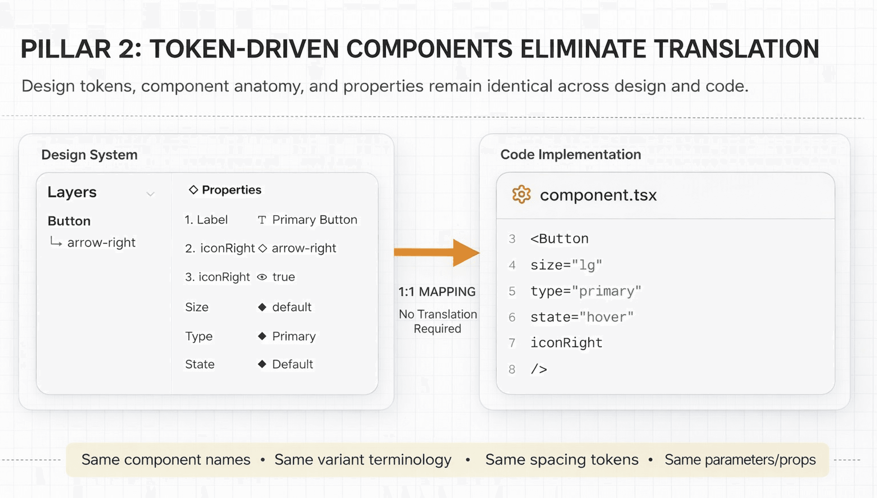
3. One-to-One Naming with Code
What exists in code must exist in Figma, with a direct, unambiguous mapping:
identical component names
identical props and variants
identical spacing and token values
Semantic names are allowed only when:
the mapping is unambiguous
the name is AI-resolvable
the underlying token remains identical
No aliases.
No decorative naming.
If it can’t be mapped to code with certainty, it doesn’t ship.
Perfect alignment is the goal, but gains appear much earlier.
Today, nearly 80% of our system is aligned — and AI smooths out the rest.
We’ve introduced a range of low-level, intermediate, and high-level components in Figma - click through to explore and understand how they come together.
6. The Global Update Rule
A non-negotiable constraint:
Change it once. Let it propagate everywhere.
To enable this, we removed entire classes of freedom:
Everything is a component
Instances are never detached
Overrides are treated as defects
Changing button padding, card spacing, or type scales now propagates:
through all designs
into generated code
across the live product
This isn’t a preference.
It’s how scalable frontend systems are built.
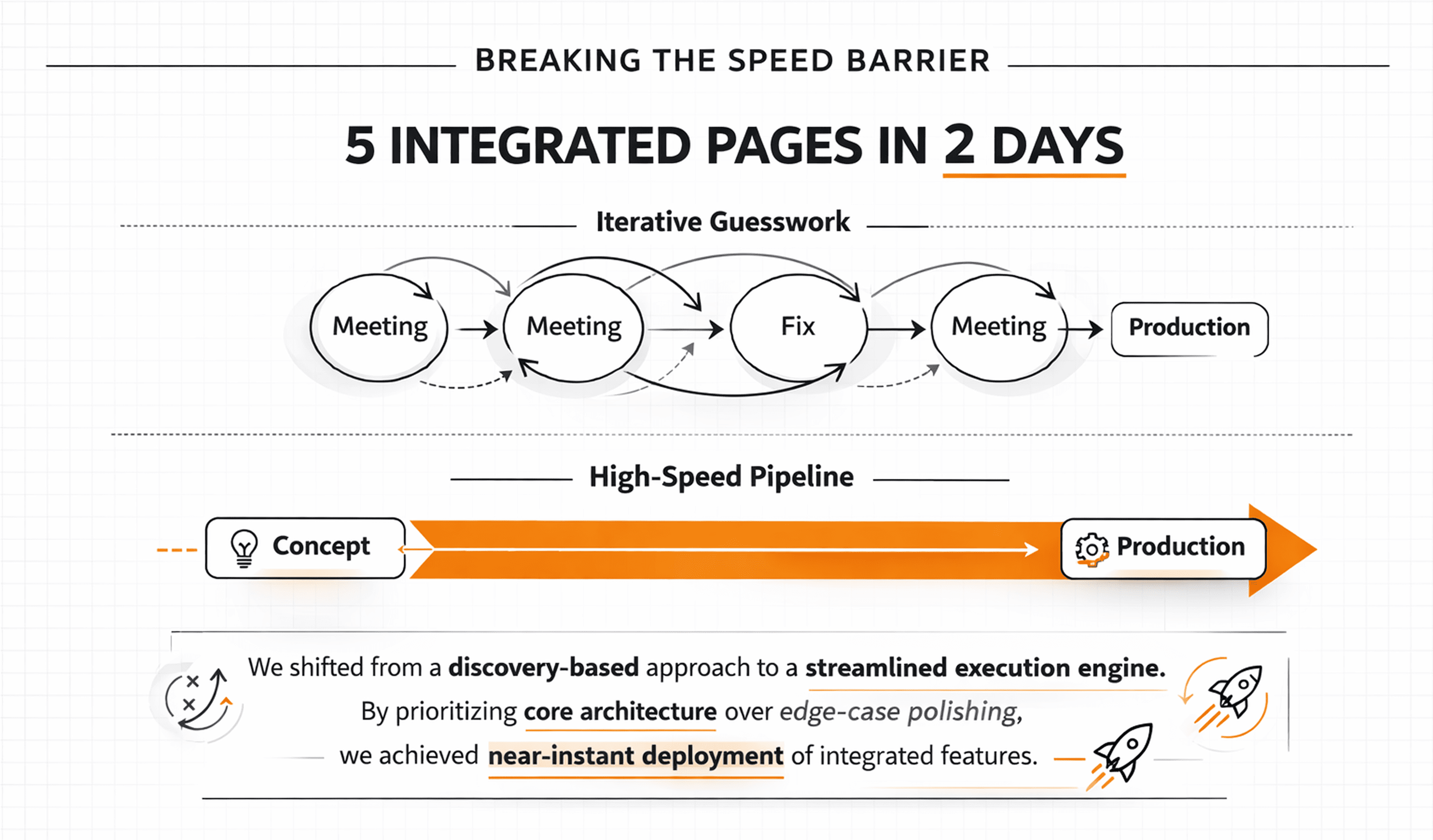
7. We broke the speed barrier without compromising production accuracy.
We just hit a major engineering milestone that feels a bit like magic : build 5, backend-integrated pages in a 2 days. By prioritizing core functionality and architectural alignment over edge-case polishing, we’ve drastically accelerated our development velocity and proven our team's ability to execute at scale. See these pages live in real production. Join the waitlist.
We broke the cycle of iterative guesswork by engineering a high-speed, automated pipeline. Our workflow has officially transitioned from a 'discovery-based' approach to a streamlined execution engine, enabling near-instant deployment of integrated features.
The Velocity Shift
The Calibration Phase: We dedicated a full day to hard-wiring our MCP tool into Figma and, more importantly, refining the "brain" of the operation. We systematically identified where the tool was tripping up, cleaned our naming conventions, and overhauled our prompting logic. By correcting those early friction points, we taught the system to translate design intent into code with surgical precision.
The 60-Minute Screen: The moment it clicked, everything changed. We went from manual coding to "conversational building," producing a production-ready screen in under an hour.
The 20-Minute Standard: Guesswork is gone. Because the "pre-work" is baked into the pipeline, we’ve compressed the delivery of complex screens down to a 20-minute flow.
The Road Ahead: While 20 minutes is fast, we aren’t satisfied. There is still room to optimize, and we are pushing for even higher velocity. Currently, the "heavy lifting" has shifted—designing in Figma is now taking longer than the actual development. We are actively working to bridge this gap and reduce the friction for our design team.
To the community: If you have tips for high-speed, production-grade design creation, share them with us! And to design team: Hang in there—we’re working on the tools to make your workflow as seamless as our new pipeline.
The Final Word
The Final Word: > Production-ready UI isn’t just about better tools; it’s about a shared vocabulary. > When we bridge the gap between design and engineering with a unified structure, the friction disappears.
The reality is simple: > If we design with the logic of a developer, AI transcends being a "helper" and becomes a powerhouse. That is how production finally becomes predictable.
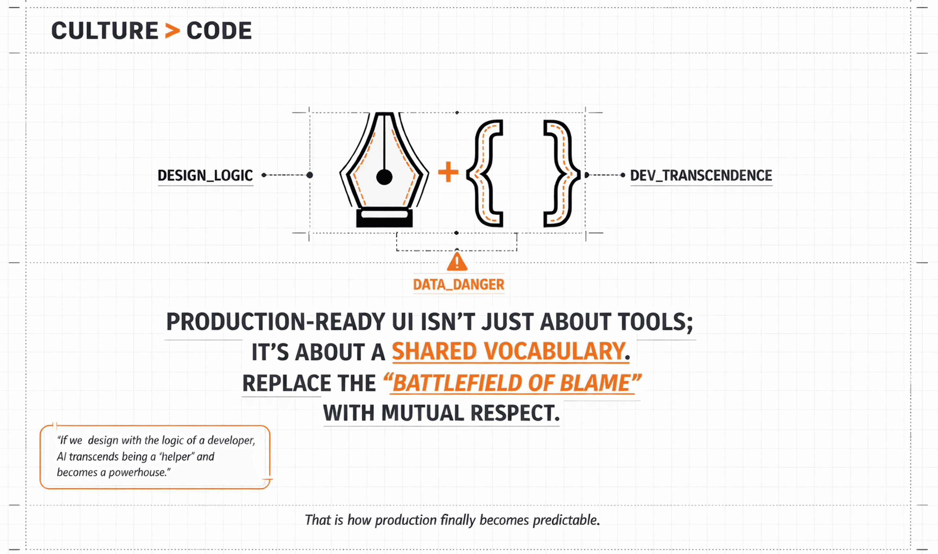
I write this as Bahubali Magadum: This isn’t just about code; it’s about how we treat one another. We must replace the "battlefield of blame" with a culture of mutual respect. We are sharing our journey to help the community —I welcome your thoughts and feedback as we build this future together.
CTO Tandemloop
Services
Blending creativity and functionality.
More Stories
Designing memorable digital experiences.
